I have been searching and searching for the correct procedure. Finally someone had to smack me down when my files were creating too much bandwith at the FTP site. (they were too big and taking up too much room!) Apparently when creating digital elements it is customary to save in certain formats.
1. For Background papers make sure that you start out with it set at 300 dpi. This will let the new owner of your kit resize to their heart's content without the original getting all pixelated. Then save your files in jpeg format.
I usually save them at 500x500 for the web for viewing purposes.
2. For elements, or anything with transparent backgrounds (ribbons, slidemounts, etc) save them as png files. People are requesting that they all be in their own individual folders for ease of use. No one wants to learn the new trick of trying to cut an embellie from a slew of them on one page.
Earlier Question: "Would someone please comment and tell me if I need to interlace or not when I save it to png????"
Answer: NO, you do not unless you are using it for webpage design.
Sunday, January 15, 2006
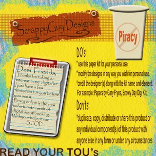
TOU
 How sad that I even have to create something like this!
 Who woulda thunk that online piracy would be sweeping the digi scrappin' world? Well, it has been and is being done. People are getting them for free or even buying designers kits and then passing them along to their friends. I understand this saves costs for you. But what about the designers who sit there for hours on end, blurring their eyesight just so you can have this beautiful kit for FREE!
Please remember if you are going to share a free kit with someone, send them the link to the site so they can download it themselves. The designers work off of the hits their websites get. If we start sending files directly to others, it takes that crucial step away from the designer. BAD BAD BAD
Saturday, January 14, 2006
Magic Mesh is SUPER easy
I absolutely had NO clue that making magic mesh would be so easy. I was creating a layout for something and thought some magic mesh would be perfect on it. I remember that Scrapbook-Bytes had a tutorial. I zoomed over there and was surprised that it had something like THREE steps. I thought this can't be possible. But it is, IT IS!!
If you click on your paintbrush tool and select the Faux Finish brushes there are several brushes already done up in the format of magic mesh. So all you have to do is set the size you want and click away.
I tried just brushing straight across, but it was one big mess. I was working on some other stuff so I kinda cheated and just clicked each section next to each other. I am sure that you could play around with the spacing and the scatter options to make it easier.
So, GO PLAY
Have you found this site?
I was reading through some posts on TheDigiChick.com
when I came across a helpful link I NEEDED to share
with y'all! http://favormark.com/ie/fem
sawyers_scrapbooking_links/776045
It lists tons of sites and links for help with PSE. Things
on backgrounds, elements, textures, filters, scripts, and
the list goes on and on!
There's something out there called BladePro that is
supposed to make element creations a snap. I have to
check it out and get back to you.
Saturday, January 07, 2006
AWESOME Photo Effect

I stumbled across Graphics.com site about photoshop effects. I saw one they did where the subject of the picture seems to be jumping right out of the frame. It was incredible and actually pretty easy to create. You just have to know how to use your magnetic lasso to isolate a shape and your distort function to pull the edges of the photos.
Here's what I did with it. What do you think?
The background is a mistake that I took while flying through the trees. I loved the blurred effect of it and thought it went well here.
UGH!!
I am NOT loving this Radiance kit. I think I am trying to use too many realistic elements. I took the photos of blankets and fabrics from the stateroom and tried using them as background papers. I resized the original photo to fit on 12x12 and then added texture, or grain, or burned some edges. I even stuck to a color palette of blue, red, browns. I am just not loving it as a kit. Would I use it? Probably not, so I have to do some thinking on this.
One bright spot was creating this tag that I thought was pretty cool. I used the star embellishment I shot in the bathroom of all places.
1. I made a simple black rectangle and then topped it with an arrow shape also in black.
2. I duplicated that layer and then reduced it a few % just to offset it from the black background. Then filled it with an antique brown color.
3. I used Richard's Old Paper Tutorial (http://www.richardsramblings.
com/archives/2005/01/001758.html) and distressed the edges of the smaller tag layer. I couldn't quite understand his ideas on dodging and burning the edges by various degrees, so I skipped that part.
4. Then I pasted in a copy of the star embellishment and reduced the opacity of that level.
Banner Idea
Subscribe to:
Posts (Atom)

